Showing posts with label work process. Show all posts

Saturday, April 21, 2012

3/25/12 - Bob McLeod Workshop-Inking

Bob McLeod was in town last month for the first Lexington Comic & Toy Convention. This was a one-day show so we were able to host Bob (been wanting to do this since I met him at Baltimore Con in 2008) for a one-day comic art workshop the following day Sunday March 25th, 2012. He is a great artist and teacher - a rare combination - if you ever get the chance to talk or study with him take it!

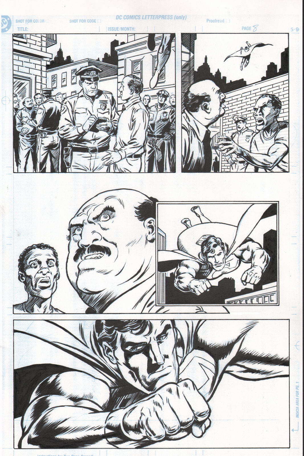
Here are some inking samples I did before the workshop: one is from Bob's pencils and the other is from Ryan Sook's pencil art. These are both original inks on 11x17" Strathmore 400 Series 2-Ply Bristol. The scanner won't do a full 17" high but the width should be right on 11". Bob asked how long  I took on the Superman page and I told him (complaining that tech pen work took forever) and he told me I was going too fast! He said at this stage I needed to slow down and work on my line control.


6:30, bristol borad smooth,
Raphael 8404 #3, Hunt 102,
Rotring Rapidliners

3 hours, bristol board vellum,
W&N SS7 #2,
pro white splatter toothbrush

bristol board smooth, all brush,
W&N SS& #2 and #3

Here is another sample that I worked on during the inking portion of the workshop. It is not finished and shows the blueline print out of the pencils. It was quite different for me to have someone watching while I tried to do this (and I was pretty frazzled from being sick and stressed from con & workshop prep). I learned I have a ways to go to be able to make the smooth and controlled marks that Bob was able to demonstrate for us. I heard Bob say to slow down but I think I do better when I kind of "attack" the page. I definitely lost my confidence on parts of this page. Like so many things in life I suppose I want to find a "happy median".

I purposely chose this page because it was tough - lots of different textures. Smoke, shiny metal armor, leather jackets, and wood. Still trying to figure out how to render the lady cop's sunglasses lens. Maybe with a colored pencil?

One thing that I am curious about is if all inkers spin the page. Bob did do this and advocated using the same, away from your body, stroke for all your lines. I have seen other inkers, most notably Tim Vigil (as seen here on youTube doing a Conan sketch) who don't spin the page.
My natural inclination is to try and make the mark as if I am drawing the line from life. When I life draw I don't spin the page - painters don't spin the canvas (at least traditional media painters). Panel two was mostly from the seminar - while panel four was done after the fact (and without turning the page). So I am a little confounded about this spin/don't spin dilemma. I guess common sense is to do whatever you have to do to make the line you want, but to also work to have the dexterity to make the lines you want from different angles.


Monday, December 27, 2010

12/27/10 - Digital - Sketchbook Pro 2010 - Rough for color image and the genesis of an idea

ironFistWinterSceneRough
We are are having a real winter here in Kentucky. Our first snow was right after Thanksgiving and now we have had several measurable snowfalls since then including only the 2nd or 3rd White Christmas I can remember! The snow has stirred creative plasma from the past..

Gil Kane (p), Tom Palmer? (i),
cover Marvel Premier #15, 1974
Iron Fist is a comics character I have followed since his first appearance in Marvel Premiere 15 back in the mid 70's. The setting of the characters origin story is a mystical Asian city high in the snowy mountains: K'un L'un is obviously inspired by the mythical city of Shangri La. Danny Rand (the current, and at that time only known, Iron Fist's real name) is only a child at this point and the expedition to find the lost city by his father, mother, Uncle and himself is memorable for the adventure aspect, the tragic loss of a parent, and the search for a more enlightened way of life. All these concepts dug deep into my tween brain. I think I really empathized with the young Daniel's plight and envied the adventure and life he was about to embark on. Men are suckers for stories about sacrifice and honor - that is why war movies are able to evoke so much feeling in us - even among the most stoic and staid of us. We are hardwired to go out and fight tooth and nail against the imminent danger to our families without a moment's hesitation or regard for own safety. Even as children we have this instinct... that is why we are drawn to certain sports or hobbies.

At that time the Martial arts were a great mystery  and held me tight in and fascination - people like Bruce Lee and Chuck Norris were incredibly influential role models. This period was near the height of the martial arts movie craze and I remember an incredible poster hanging in the hall at my elementary school Linlee.

Neil Adams, cover
Deadly Hands of Kung Fu #1
 Magazine, April 1974
It was fifth or sixth grade and I was absolutely stricken by envy for the fellow artist and classmate (Mark Desmond?) who created this image of Bruce Lee applying a flying leap kick to strike down his enemy. This large, poster-board masterpiece I later found out was a recreated Neil Adams (who would soon rise to near god-like status in my pantheon of comic artists) cover from an issue of Deadly Hands of Kung Fu - a Marvel Magazine. This revelation elevated my ecstatic longing even more since this was a more adult (almost akin to Playboy! not for nudity but intense adventure) form of comic than what I was currently reading and very elusive (much like Shangri La) publication for me to ever attain or read. (For an eleven-year old boy in 1974 there weren't a lot o back issue buying options like we have today! No comic shops, no internet, no eBay!).

So anyway, I was a faithful follower of this Marvel character and very much enjoyed the early story arcs (never liked IF as superhero - but have always felt he was better suited to the adventure genre!

Paul Gulacy (p) Jack Able?(i), HoSC-MOKF #29, June 1975, 
I wished he had been treated more like Marvel's other MA inspired character, Shang Chi, who got to live in a Bruce Lee Meets James Bond world.

James Steranko, cover
Doc Savage #3, February 1973
The Shang-Chi - Master of Kung Fu comic enjoyed the best art Steranko never did! Here is a sample of that seminal comic by another 'revered on high' artist: Paul Gulacy.

I was too young to experience most of Jim Steranko's comic work and only saw a bit of his work through his self published mag. But I think I did get this Doc Savage (another influential comic and pulp character on my young impressionable psyche) comic with his cover art. The black and white image is an illustration from the novel based on the Chandler detective series and proof that comics are very incestuous in the way one artist influences another. Frank Miller was thought to be very cutting edge with his graphic high contrast black and white style he used to great success in his noir crime comic series Sin City.